Explorations of Pimoroni's Enviro pHAT sensor HAT on a Raspberry Pi Zero
RPi on battery running a Jupyter notebook server, accessed remotely via wifi
Andrew Ganse, http://research.ganse.org
import time
from envirophat import light, motion, weather, leds
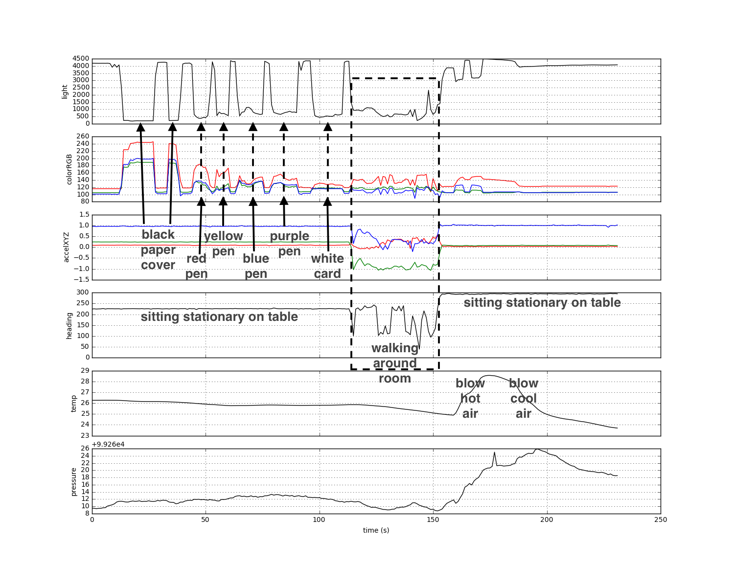
# device laying on table
print light.light()
print light.rgb()
print weather.temperature()
print weather.pressure()
print motion.accelerometer()
print motion.heading()
# device laying on table with heavy sheet paper over it
print light.light()
print light.rgb()
print weather.temperature()
print weather.pressure()
print motion.accelerometer()
print motion.heading()
out = open('enviro.log', 'w')

try:
    while True:
        lux = light.light()
        leds.on()
        rgb = light.rgb()
        leds.off()
        acc = motion.accelerometer()
        heading = motion.heading()
        temp = weather.temperature()
        press = weather.pressure()
        print('%d %d %d %d %f %f %f %f %f %f' % \
              (lux, rgb[0], rgb[1], rgb[2], acc[0], acc[1], acc[2], heading, temp, press))
        out.write('%d %d %d %d %f %f %f %f %f %f\n' % \
              (lux, rgb[0], rgb[1], rgb[2], acc[0], acc[1], acc[2], heading, temp, press))
        time.sleep(1)  # (set to "time.sleep(0.1)" for second run)

except KeyboardInterrupt:
    leds.off()
    out.close()
import csv
data_file = open('enviro.log')
file_reader = csv.reader(data_file, delimiter=' ')

lux=[]; colorR=[]; colorG=[]; colorB=[]
accX=[]; accY=[]; accZ=[]; heading=[]; temp=[]; press=[];
for row in file_reader:
    lux.append(row[0])
    colorR.append(row[1])
    colorG.append(row[2])
    colorB.append(row[3])
    accX.append(row[4])
    accY.append(row[5])
    accZ.append(row[6])
    heading.append(row[7])
    temp.append(row[8])
    press.append(row[9])
import matplotlib.pyplot as plt
%matplotlib inline
f, ax = plt.subplots(6, sharex=True, figsize=(15, 12))

ax[0].plot(lux,'k')
ax[0].set_ylabel('light')
ax[0].grid(True)
ax[1].plot(colorR,'r')
ax[1].plot(colorG,'g')
ax[1].plot(colorB,'b')
ax[1].set_ylabel('colorRGB')
ax[1].grid(True)
ax[2].plot(accX,'r')
ax[2].plot(accY,'g')
ax[2].plot(accZ,'b')
ax[2].set_ylabel('accelXYZ')
ax[2].grid(True)
ax[3].plot(heading,'k')
ax[3].set_ylabel('heading')
ax[3].grid(True)
ax[4].plot(temp,'k')
ax[4].set_ylabel('temp')
ax[4].grid(True)
ax[5].plot(press,'k')
ax[5].set_ylabel('pressure')
ax[5].grid(True)
ax[5].set_xlabel('time (s)')  # sample rate was 1sec
f.savefig("data.png")
# second dataset focusing on acccelerations in 3 axis directions...
# (note this run was done with sample rate 10 Hz)
import numpy as np
f, ax = plt.subplots(1, figsize=(15, 3))
t=np.arange(0,float(len(accX))/10.0,0.1)
ax.plot(t,accX,'r.-')
ax.plot(t,accY,'g.-')
ax.plot(t,accZ,'b.-')
ax.set_ylabel('accelXYZ')
ax.grid(True)
ax.set_xlabel('time (s)')  # sample rate was 1sec
f.savefig("data2.png")
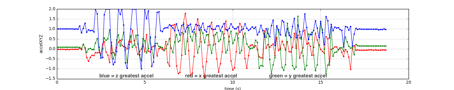
With roughly 1Hz period, I first shook the device vertically up and down about 5-6 times, then left/right about 5-6 times, then fwd/back 5-6 times. We can see the three directions reasonably well in the data, given the caveat that I had no idea which directions were the device's unit directions and wasn't be very careful anyway. Note for this run I increased the sampling rate to 10Hz to catch my roughly 1Hz shaking period.